DESIGN GUIDE · MAHJONG SCORE PADS
How to Design Readable Mahjong Score Pads for Clubs and Events
Build a clear layout, give handwriting enough room, and test the complete experience with a physical sample.
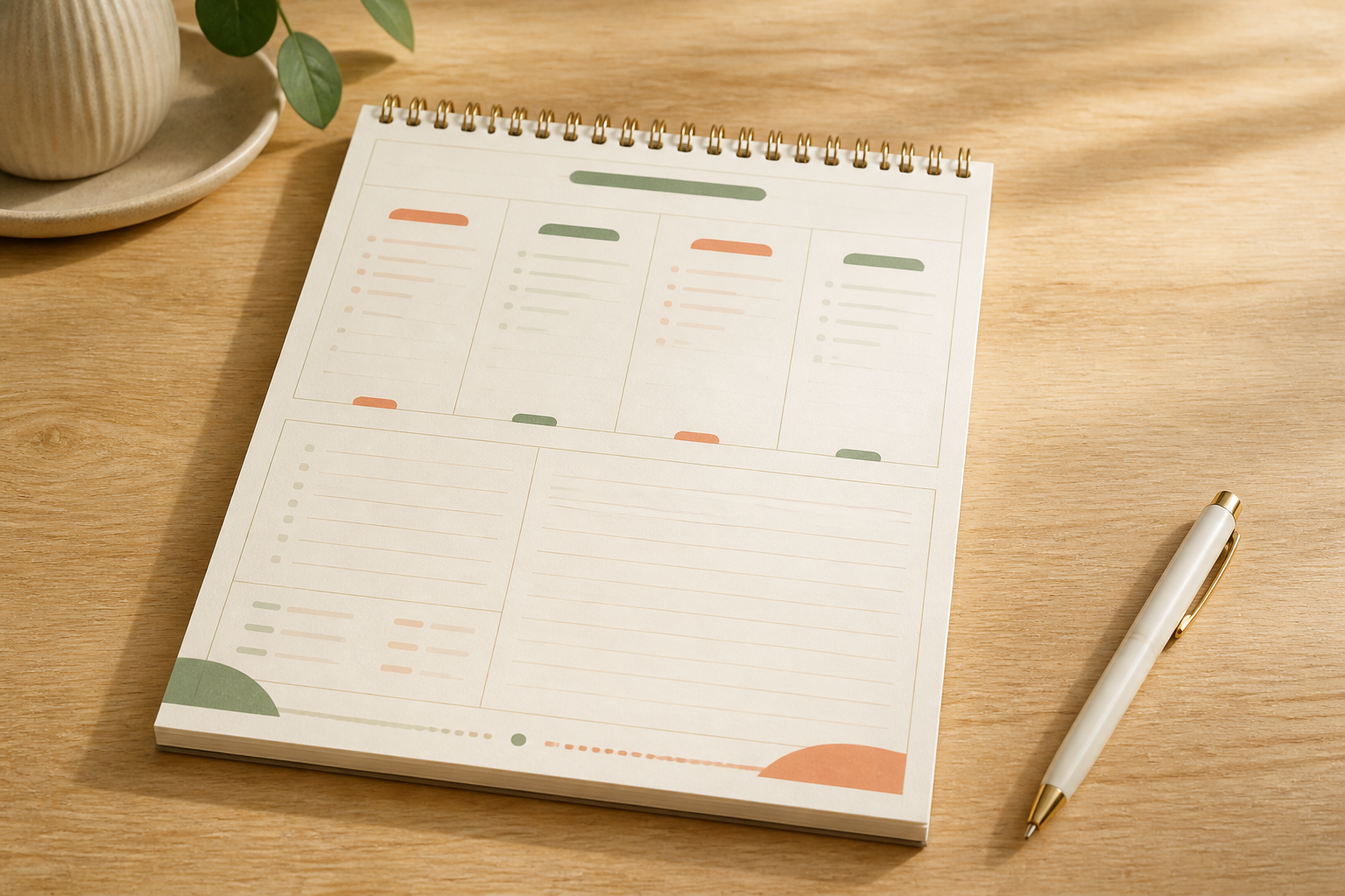
A readable Mahjong score pad should be easy to understand at a glance and comfortable to write on during a busy club session or event. The most useful layouts combine clear headings, consistent spacing, strong contrast, generous writing areas, and a page structure that remains legible under ordinary table lighting. The final design should also be tested as a physical sample rather than approved from a screen alone.
For clubs, readable score pads help different tables use the same approved format consistently. For event organizers, they make setup easier and reduce avoidable confusion. For retailers and custom brands, a well-planned layout supports a polished product without decorative elements competing with the page's practical purpose.
What is readable Mahjong score pad design?
Readable Mahjong score pad design is the process of arranging authorized headings, writing fields, lines, spacing, and visual cues so users can quickly find the correct area and record information comfortably.
A practical design should answer six questions:
- Can users identify the main sections quickly?
- Is the text large and clear enough under typical table lighting?
- Are writing areas wide and tall enough for real handwriting?
- Does the page remain organized when it is partly completed?
- Do the paper and binding support the intended writing experience?
- Has the printed sample been tested by representative users?
This is a usability and product-design process. It does not require reproducing protected instructions or third-party game content.
Begin with the real use environment
Before adjusting fonts or colors, define where and how the pad will be used. A score pad for a casual home table may have different priorities from one used repeatedly by a club, event host, teaching group, or retailer's gift set.
Confirm the practical conditions first:
- Number of people likely to view or write on one sheet
- Typical table size and viewing distance
- Lighting conditions
- Pen or pencil preference
- Whether users write while seated or standing
- Whether the pad stays in one place or moves between tables
- Whether users may benefit from larger type or stronger contrast
These details turn a visual concept into a useful product brief. They also help prevent a common mistake: approving a page that looks attractive at full size on a monitor but feels crowded when printed.
Build a clear visual hierarchy
Visual hierarchy tells users where to look first, second, and third. It can be created with type size, weight, spacing, alignment, and restrained color use.
- Use one clearly recognizable page heading.
- Keep section headings and repeated field styles consistent.
- Leave enough white space between unrelated areas.
- Use alignment that makes the page easy to scan.
- Keep decorative graphics away from writing zones.
Avoid making every element equally bold. When headings, borders, colors, and icons all compete for attention, the page becomes harder to scan. A limited and repeatable style system is usually more effective.
Give handwriting enough room
Writing fields should be tested with real handwriting, not estimated only from the digital layout. Narrow rows and small boxes may look efficient but can become difficult to use once a pen, hand position, and normal writing speed are involved.
Review row height, column width, space around field labels, the distance between printed lines and handwritten entries, clearance near the binding edge, and space for corrections or notes when they are part of the authorized design.
Print the artwork at 100% scale and complete a sample page with the pens most likely to be used. This simple test often reveals crowding, weak contrast, or awkward field sizes before a production sample is made.
Choose legible typography and contrast
Type should remain clear at the final printed size. Thin lettering, compressed fonts, and very small text can lose clarity after printing, especially on colored backgrounds.
- Use a clean typeface for functional labels.
- Keep capitalization and punctuation consistent.
- Avoid long lines of small text.
- Maintain strong contrast between text and background.
- Do not place important text over detailed patterns.
- Check lighter colors in a printed proof instead of relying on screen brightness.
Brand personality can still appear through a controlled color palette, a distinctive heading style, or original decorative artwork. Functional information should remain the visual priority.
Keep printed content authorized and purpose-specific
Every word, icon, illustration, and layout element supplied for production should be original, properly licensed, or used with permission. Do not copy third-party score sheets, protected instructions, branded terminology, logos, or recognizable layouts.
The safest workflow is to provide final approved text supplied by the buyer, original or licensed artwork, written confirmation of any third-party permissions, a clearly numbered artwork version, and a print-ready file with bleed and safe areas where required.
American Mahjong Supply can review manufacturing practicality, but the buyer should confirm rights to all supplied content before sampling and production.
Match paper and binding to the writing experience
Layout readability is connected to the physical product. Paper color, surface, opacity, thickness, and binding position can affect how easily the page is read and used.
Consider whether the paper provides a comfortable surface for the intended pen or pencil, limits distracting show-through, keeps printed lines and light colors visible, and feels appropriate for the intended use. Important writing areas should not sit too close to glue, staples, wire, or another binding structure.
Review a physical sample before production
Check a physical sample under realistic conditions. Ask representative users to scan the page, find key areas, and write on it naturally. Observe where they pause, cover information with their hands, or run out of writing space.
Use a written checklist to confirm final size and orientation, text legibility, contrast, writing comfort, printed color, binding clearance, page order, sheet count, packaging, and artwork version. Record changes in one consolidated revision list so conflicting comments do not create avoidable production risk.
Plan timing as a conditional reference
For custom score pads, the MOQ is confirmed by inquiry because specifications, binding, sheet count, packaging, and finishing can vary. A regular physical sample is typically around 10 days. Score-pad bulk production is typically around 20–25 days.
These are planning references, not fixed delivery promises. Actual timing depends on the final specification, approved artwork, process, quantity, production schedule, and any required revisions. Transportation time is separate and should be planned according to the destination and shipping method.
Readable score pad design checklist
- Intended users and use environment
- Final page size and orientation
- Clear visual hierarchy and legible type
- Strong text-to-background contrast
- Comfortable writing areas and consistent spacing
- Original or authorized content
- Paper and writing-tool compatibility
- Binding clearance and correct artwork version
- Physical sample test
- Conditional production and transportation plan
The best score pad is not the one with the most decoration. It is the one users can understand and use comfortably while still feeling consistent with the approved brand.
Frequently asked questions
What makes a Mahjong score pad easy to read?
Clear headings, consistent spacing, strong contrast, comfortable type sizes, and generous writing areas make a score pad easier to read. The design should be checked at final printed size and tested under normal table lighting.
Should a score pad be tested before bulk production?
Yes. A physical sample helps verify size, typography, contrast, writing space, paper, binding, sheet count, and packaging. Screen review alone cannot confirm the full writing experience.
Can a custom score pad use decorative patterns?
Yes, when the artwork is original or authorized and the pattern does not interfere with functional text or writing areas. Important information should not be placed over visually busy backgrounds.
What is the MOQ for custom Mahjong score pads?
Custom MOQ is confirmed by inquiry because size, paper, sheet count, binding, printing, finishing, and packaging can change the production plan.
How long do custom Mahjong score pads take to produce?
A regular physical sample is typically around 10 days, and score-pad bulk production is typically around 20–25 days. Timing is conditional on the specification, artwork, process, quantity, production schedule, and revisions. Transportation time is separate.
PLANNING A CUSTOM SCORE PAD?
Share the intended use and product specification.
Send the finished size, sheet count, paper preference, binding, authorized artwork, packaging idea, quantity, destination, and target timing for a project-specific review.
Start a project discussion ->Plan custom score pads for clubs and events.